A concept site for an artisan cheesemaker
St. Marcus is a self-initiated concept for an artisan cheesemaker with a long family history. Most heritage food brands play it soft and beige; I went the other way — a loud yellow on near-black, a blackletter logo for the tradition, and big editorial type. It looks expensive without looking old-fashioned. Built for desktop, then rebuilt for mobile.
Scope of Work
- Web Design
- UI Design
- Mobile Design
- Concept
- Figma
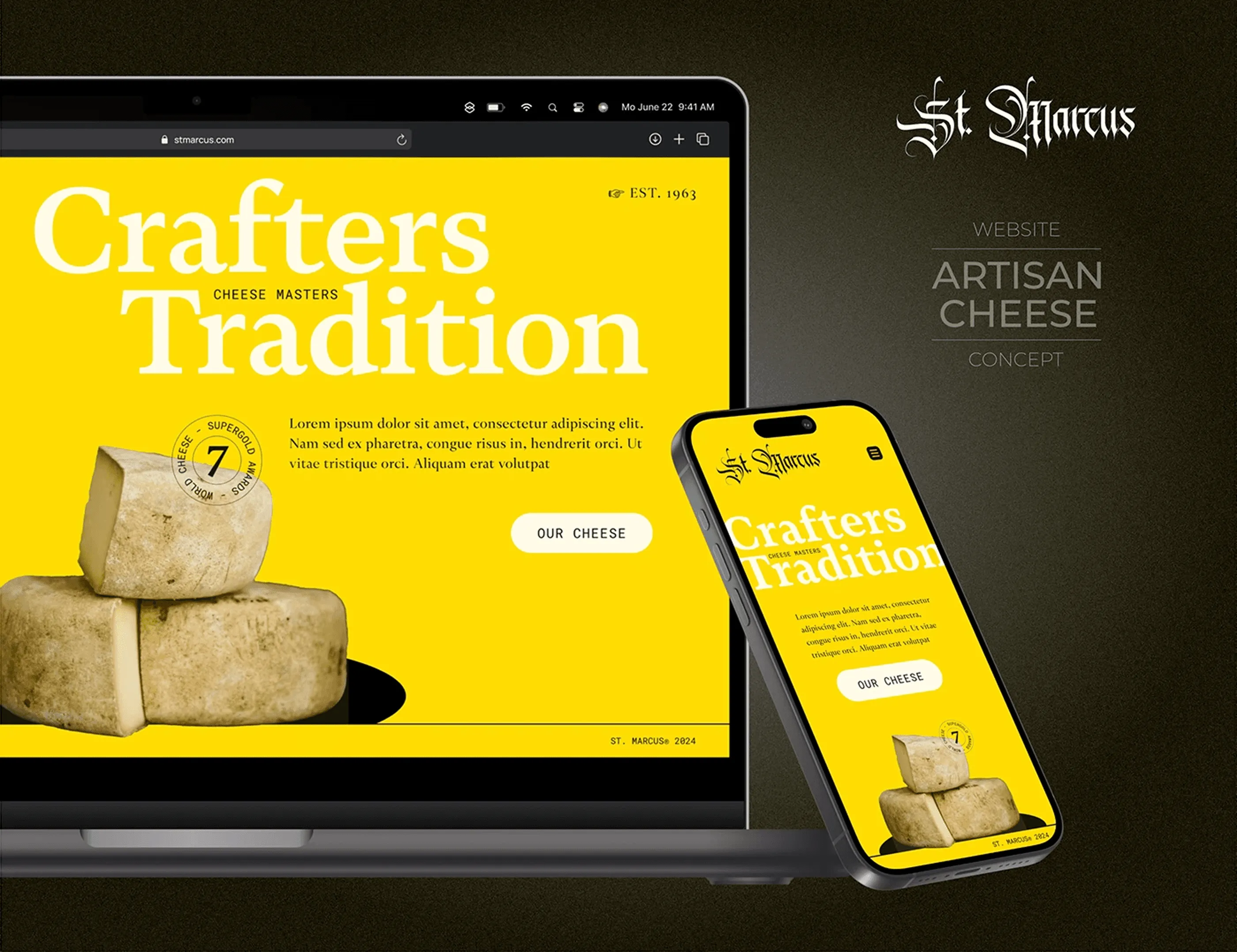
Desktop and mobile in one shot
The concept shown on desktop and mobile together, which is the fastest way to see that the personality survives the change of screen. Heritage food brands usually soften as they get smaller, losing the contrast that made them interesting. Here the yellow, the blackletter logo and the oversized serif hold at every width, because the responsive design was built as a second layout rather than a squeezed version of the first.
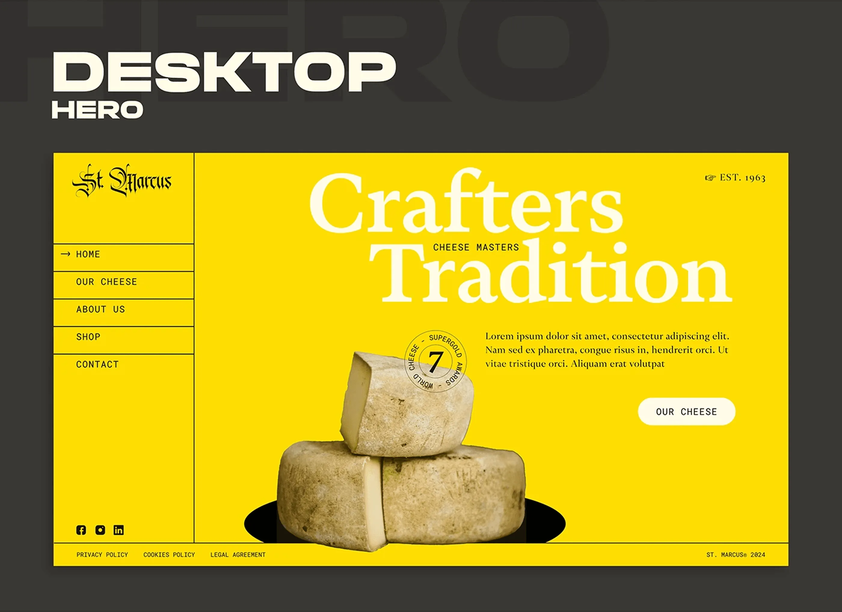
Crafters tradition
The homepage opens on flat yellow with the product photographed against it and no gradient, texture or barn in sight. The blackletter wordmark carries the tradition, the oversized serif carries the volume, and the vertical sidebar navigation keeps the whole top of the screen free for the cheese. Most artisan food web design leans rustic, so going graphic and loud was the fastest way to look premium instead of quaint.
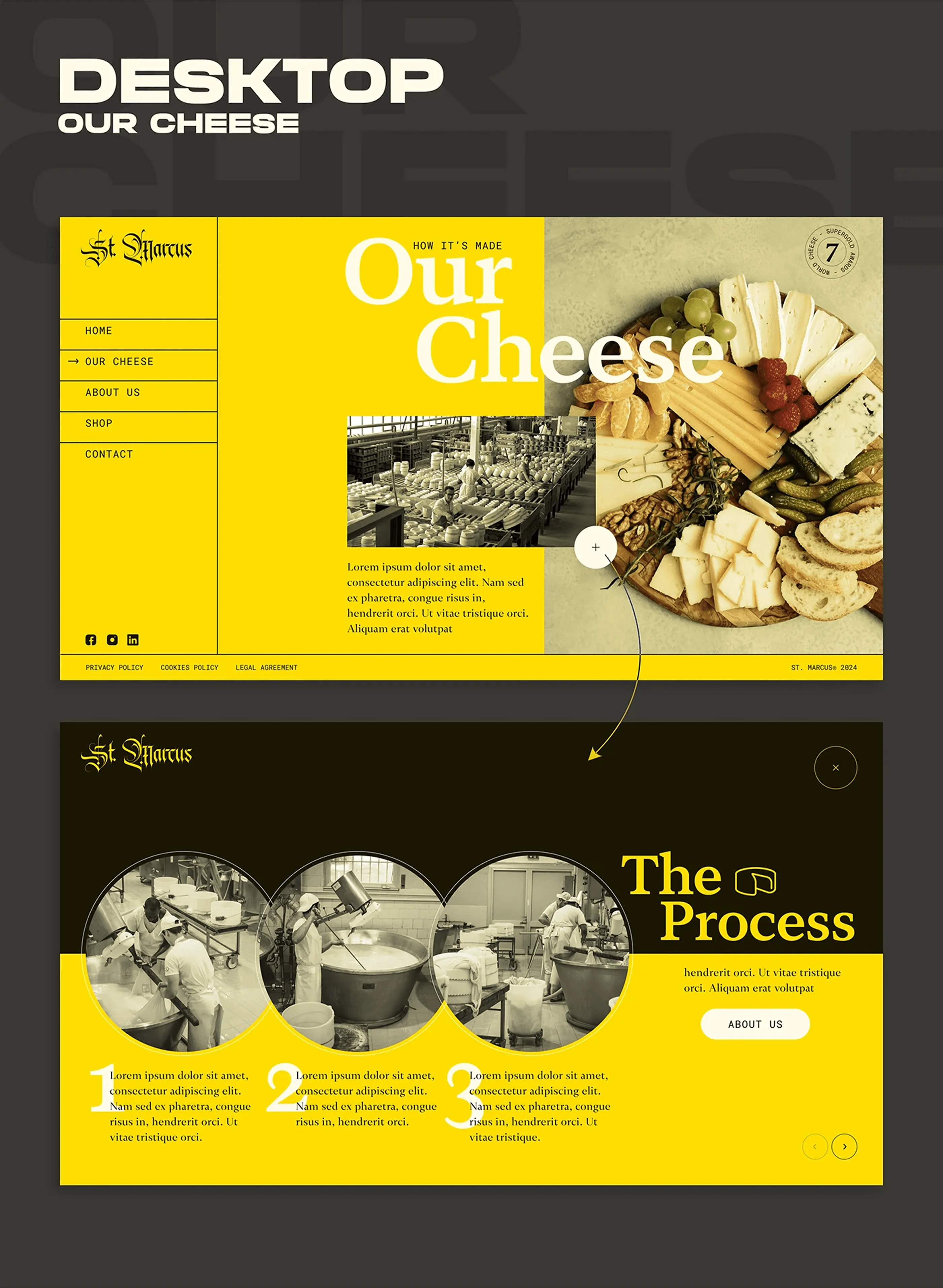
How it is made
The product page splits into two halves that answer two different questions. On the left the tasting board, shot styled and full of colour, for the visitor deciding whether they want it. On the right the dairy itself in black and white archive photography, for the visitor deciding whether to trust it. Below, the process runs as a numbered three-step sequence, which gives the page a rhythm the rest of the layout picks up.
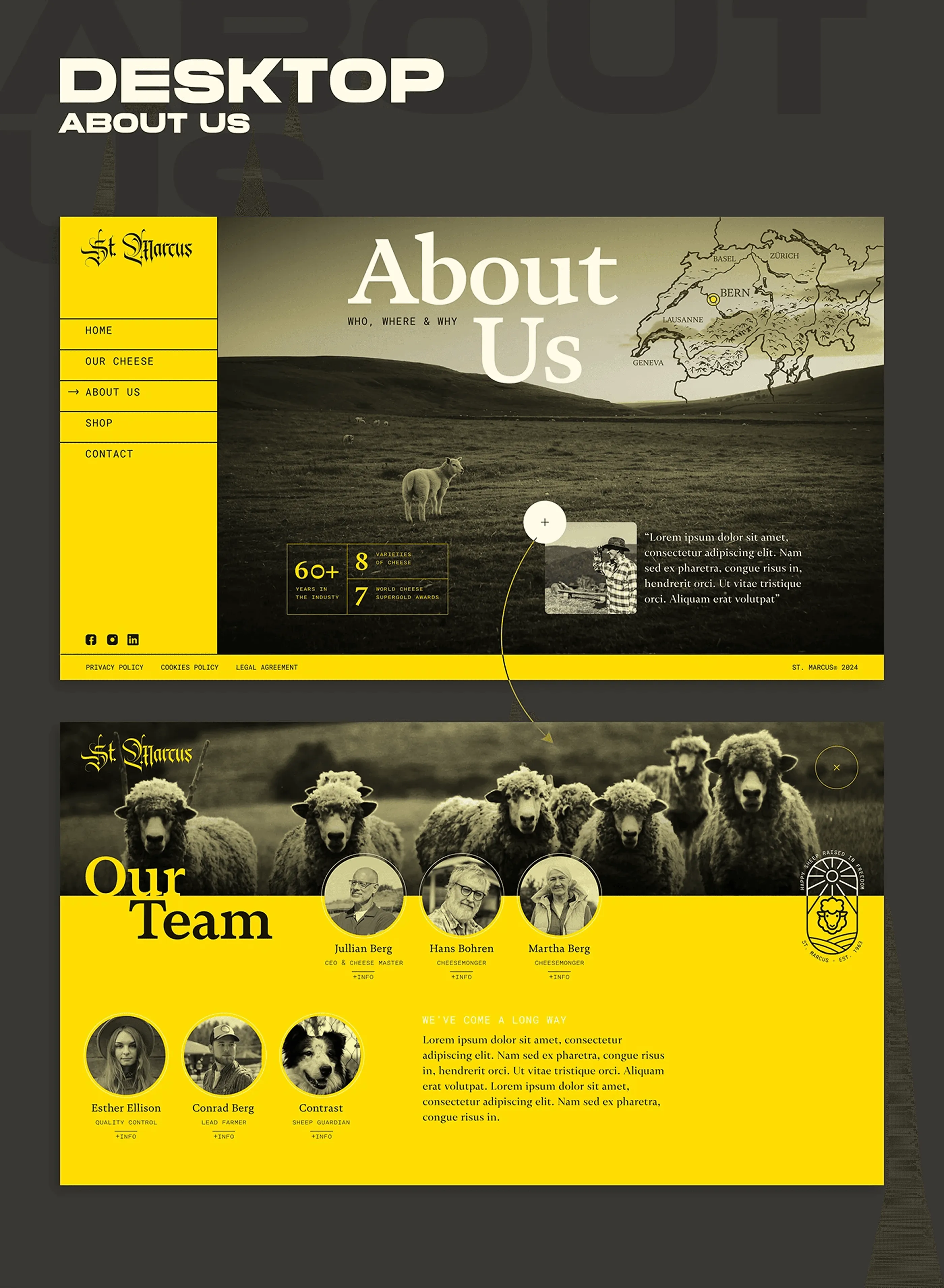
Seven generations
The story of a family that has been making cheese for seven generations, told with archival texture, a map and a set of numbers that back up the claim rather than decorate it. The team grid at the bottom puts faces to the operation, which matters for a small producer selling at a premium. This is the section that justifies the price before the shop ever asks for it.
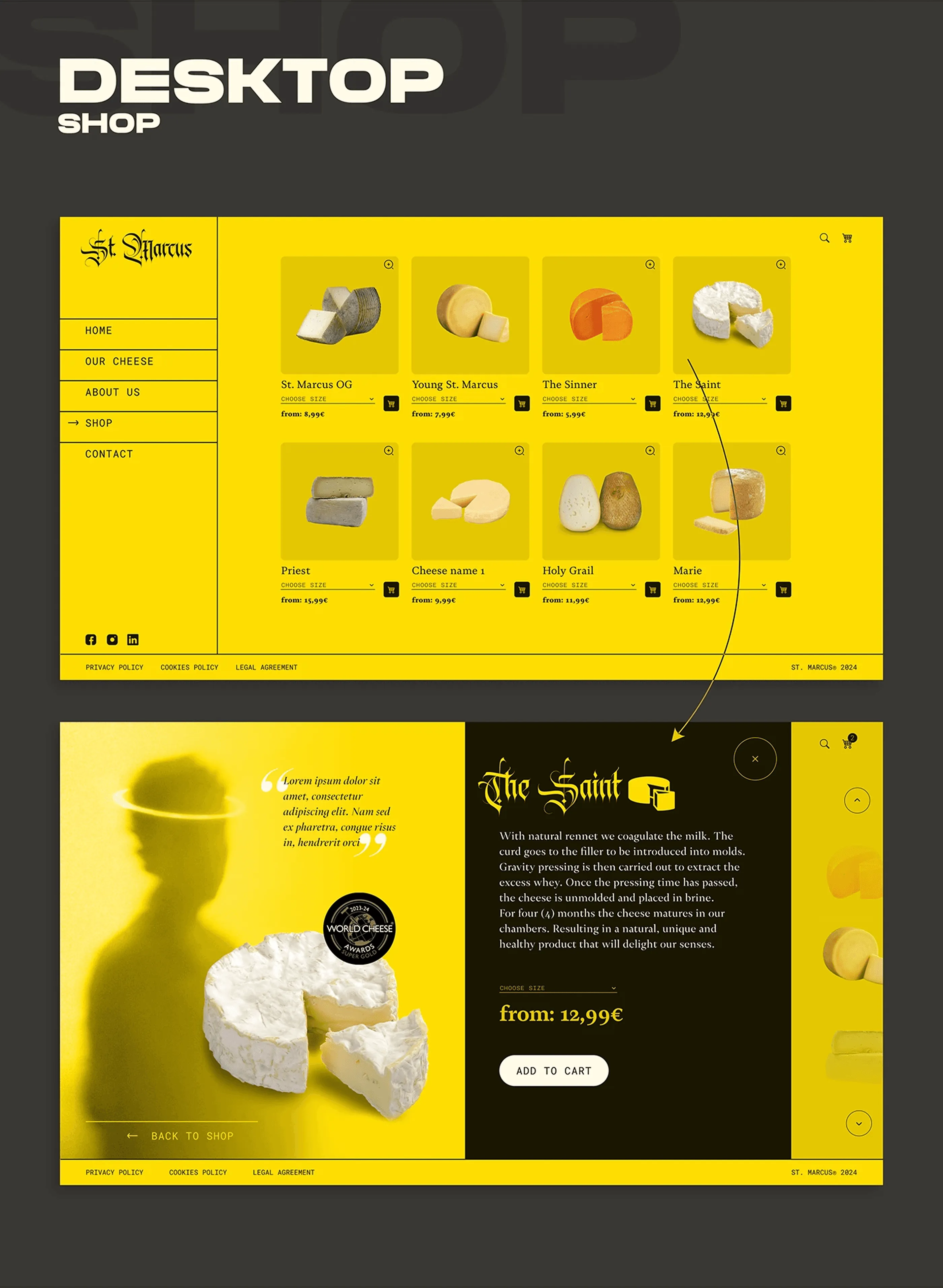
The cheese counter
The e-commerce side, built as a plain product grid on flat yellow so the cheeses themselves carry all the colour and shape variation. Each card keeps price and weight visible without a hover, because hidden pricing kills conversion in food retail. The product page underneath goes fuller, with the maturation story, the award seal and the add to cart action sitting where the eye lands after reading.
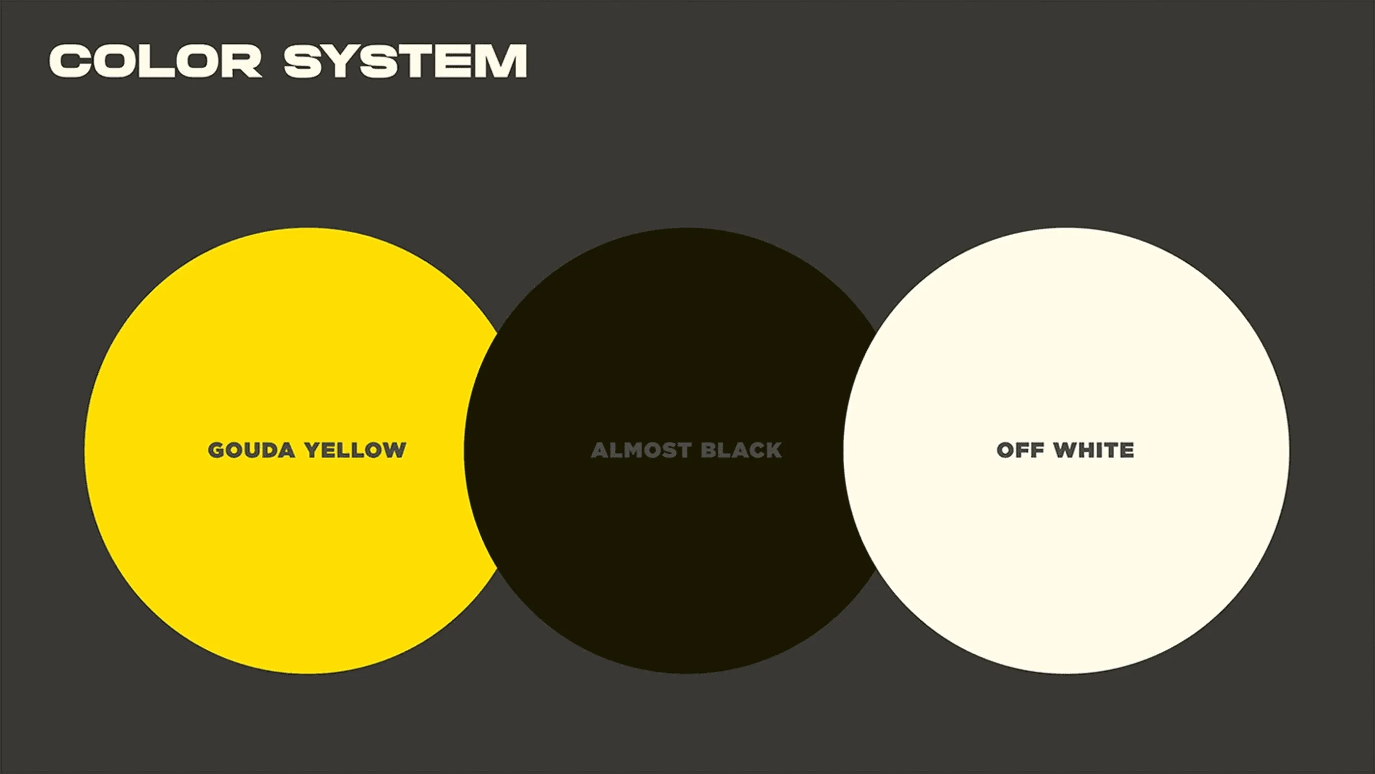
Three colours, no more
Three colours and nothing else. Gouda Yellow does the branding, Almost Black holds every background and Off White does the reading. The restraint is the whole point, because the moment a fourth colour enters, the yellow stops being an identity and becomes decoration. Limiting the palette this hard is also what lets the same colour system work across the website, the packaging and the social templates.
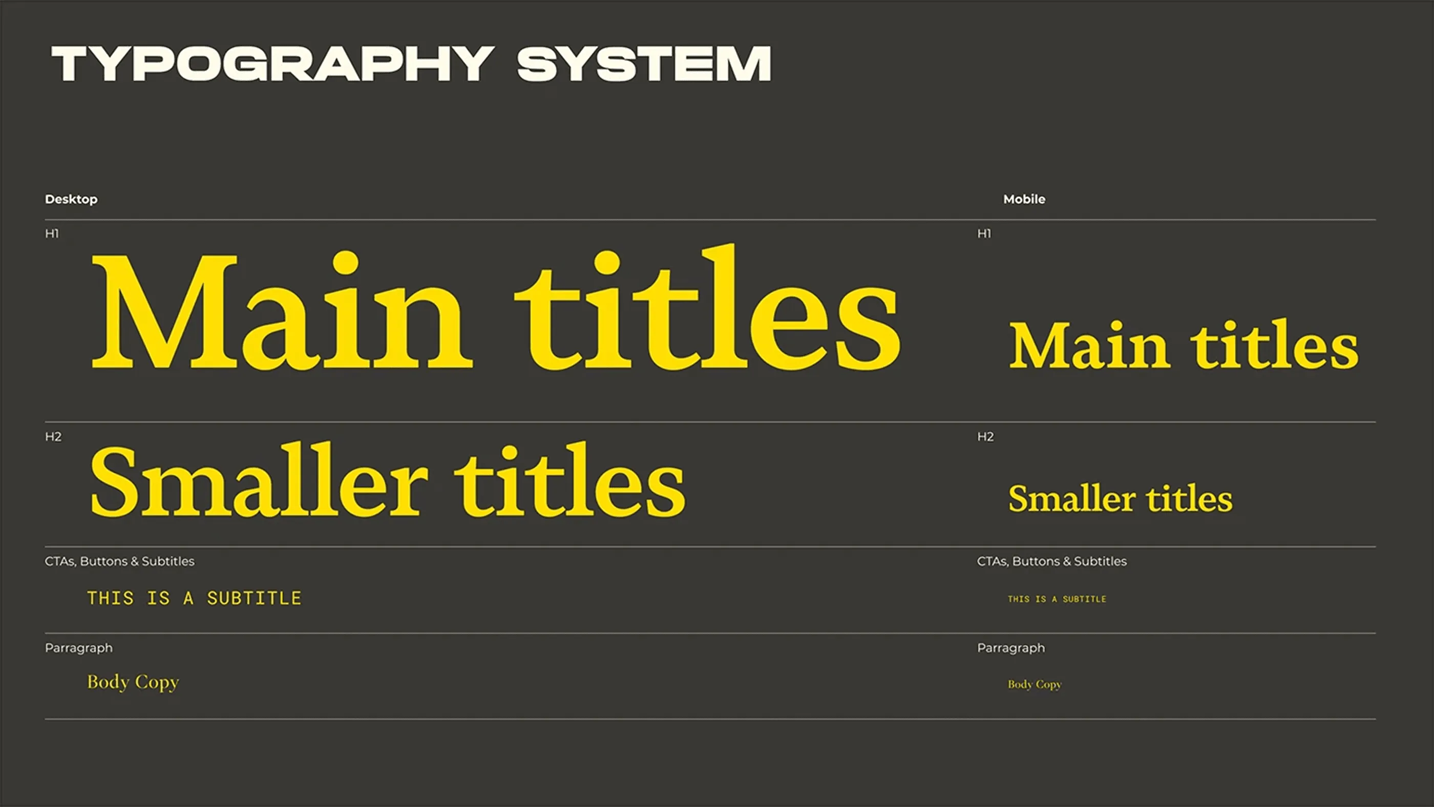
One serif doing the heavy lifting
A display serif carries the titles and a monospaced face handles buttons, labels and subtitles, which is the pairing that keeps the design from looking purely traditional. Every level is specified for desktop and mobile separately, with its own size and weight, so the hierarchy survives the jump instead of collapsing into two sizes. Setting the type system this way makes the layout predictable to build later in Framer or in code.
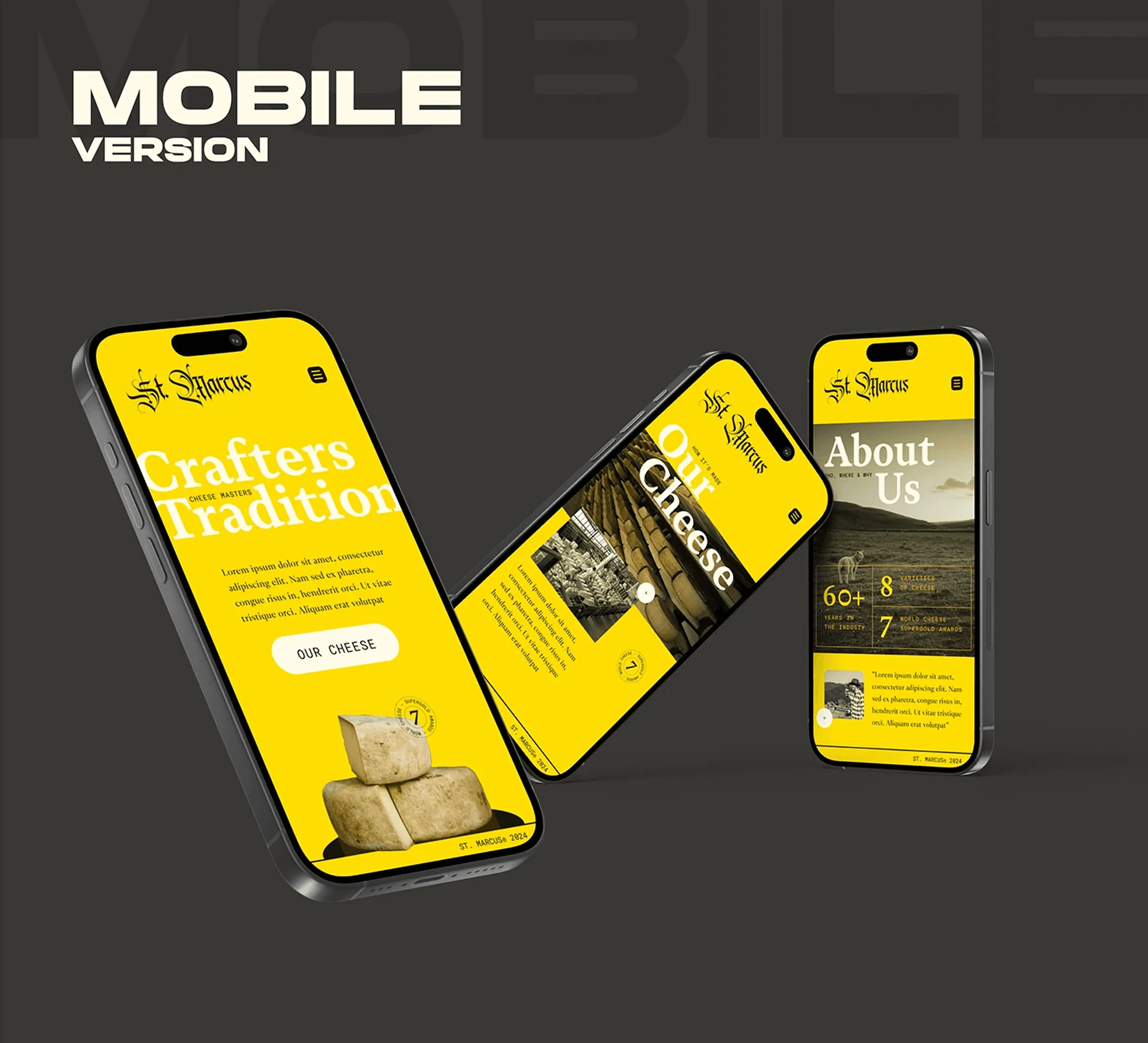
Built for the phone, not shrunk
The full site rebuilt for the phone, not scaled down from the desktop file. The contrast, the serif volume and the yellow all stay at full strength, which is where most responsive design quietly loses the brand. The three screens here show the home, the story and the product flow, so the mobile version reads as a complete experience rather than a sample.
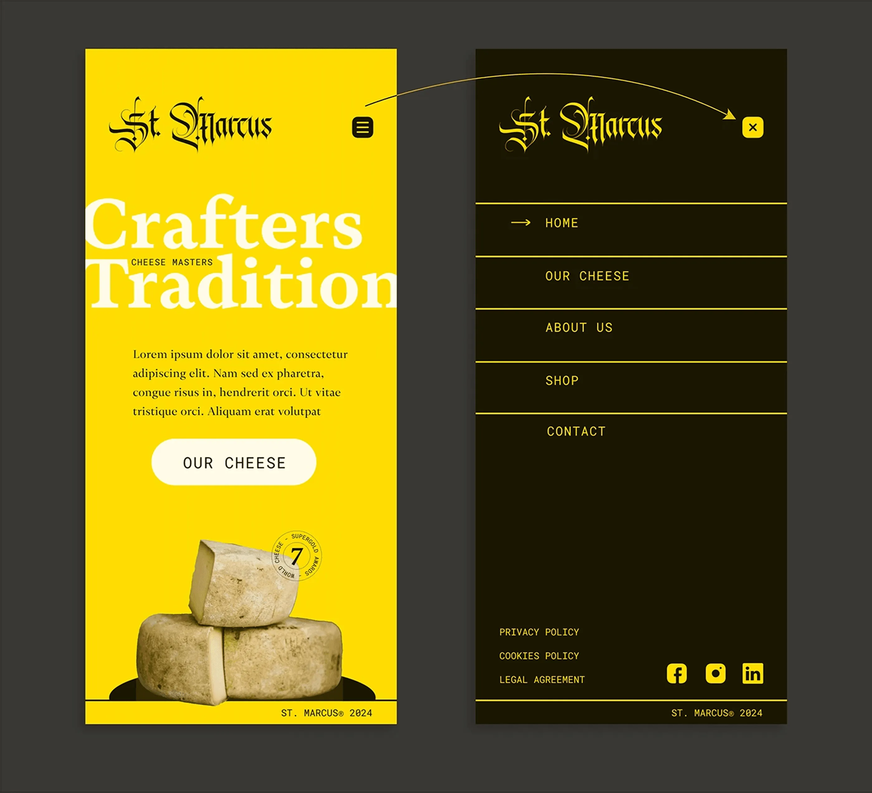
Home and navigation
The mobile homepage keeps the full-bleed yellow and the oversized serif, with the copy reflowed to a single column and the cheese anchored to the bottom of the viewport. The menu opens as a full-screen overlay in Almost Black with generous tap targets, sized for thumbs rather than cursors. Navigation on a food site has to be quick, because the visitor is usually one hand and a distraction away from leaving.
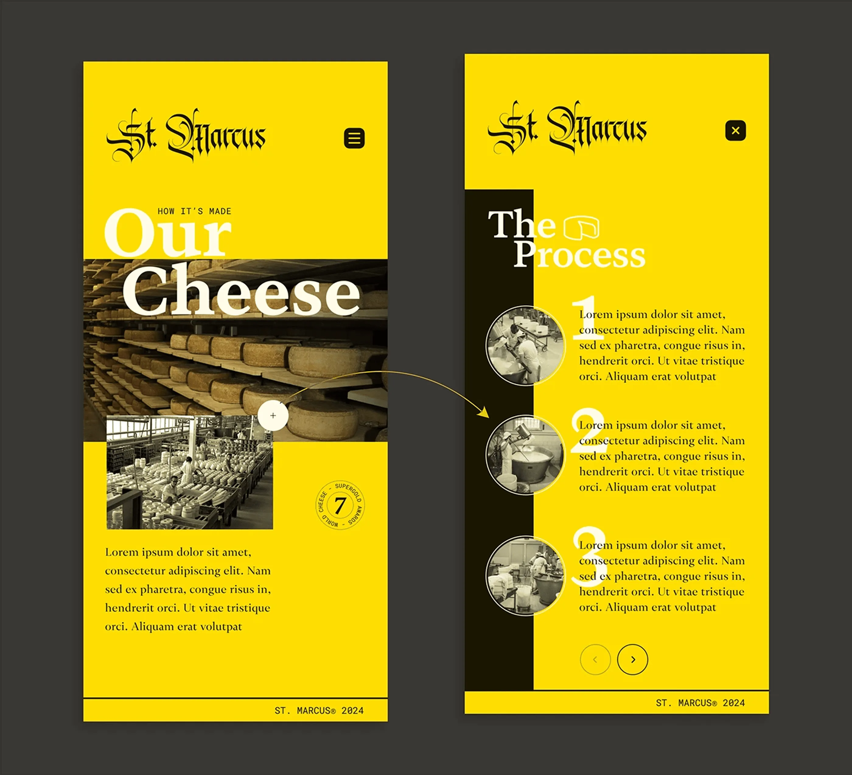
Our cheese, vertical
The Our Cheese section restacked for vertical reading. The tasting board and the dairy photography sit one above the other instead of side by side, and the three-step process becomes a scrollable sequence with the numbers kept large. The editorial feel survives the narrower column because the type scale was designed for it, not adapted after the fact.
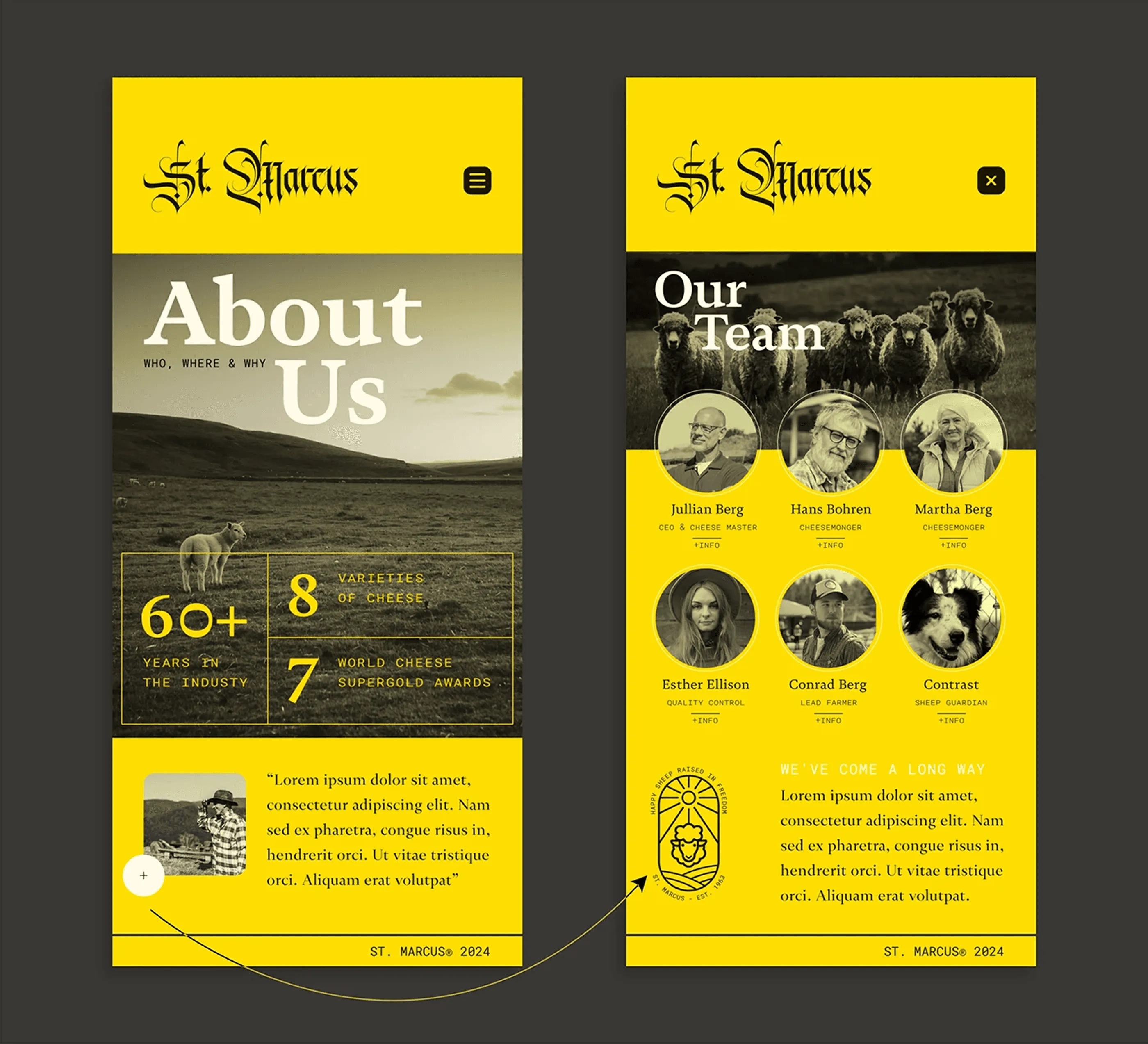
About and team
The history and the team on a narrow screen, with the archive photography and the numbers reordered so the story still builds in the right order. The team grid drops from a row to a two-column layout that keeps the faces large enough to register. Small producers sell on people, so this section keeps its weight in the mobile design instead of being cut.
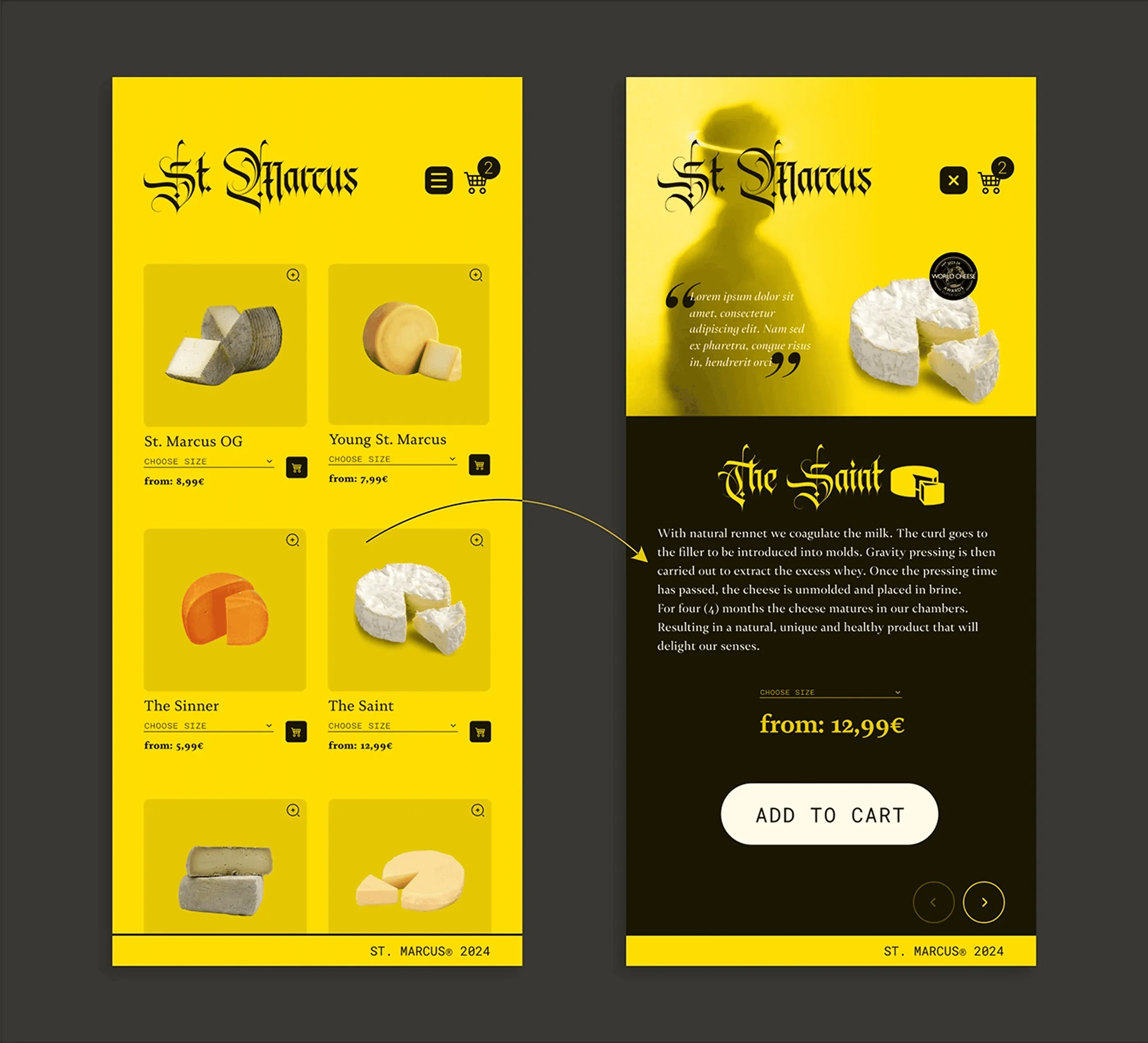
Shop on mobile
The shop on mobile, with the product grid reduced to two columns and the cart action pinned within thumb reach. The product page keeps the maturation copy and the award seal, because trimming the story on mobile is the usual reason food e-commerce converts worse there. Same content, different container, which is how the responsive design was approached throughout.
Need a website like this for your business? See my web design services or book a free call.