A concept site for a seafood restaurant
Bleu de Toi is a self-initiated concept for a seafood restaurant in Scilla, on the Calabrian coast. Two jobs: make people hungry, and get them to book a table. So the site is mostly photography — the sea, the town, the plates — over deep navy, with a serif display face and one warm orange for every booking button. Desktop first, full mobile after.
Scope of Work
- Web Design
- UI Design
- Mobile Design
- Concept
- Figma
The hero in motion
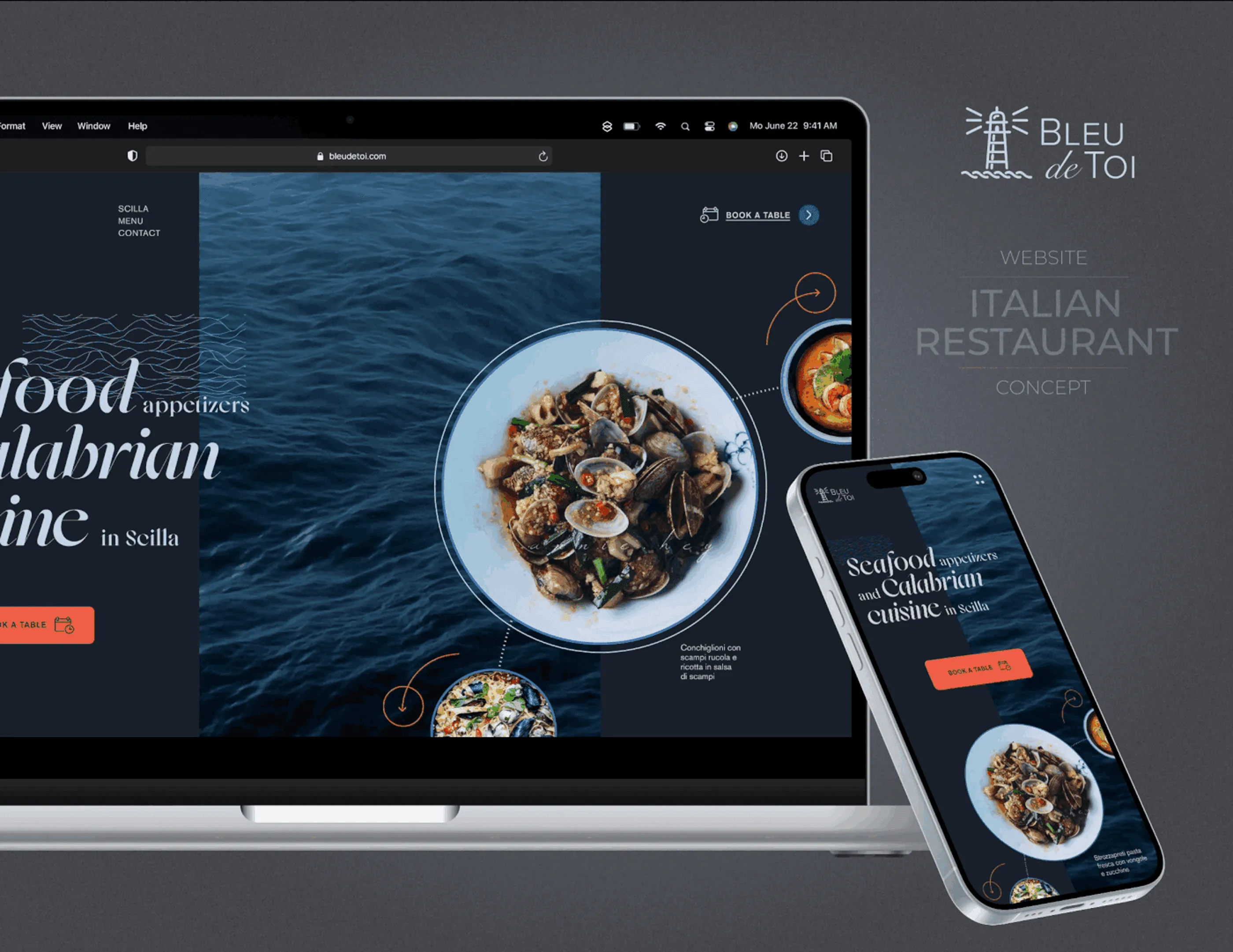
The homepage opens with the sea moving behind a headline that stays perfectly still. Motion is used once and only here, because a restaurant website has to feel alive without turning into a showreel. The dish holds its position through the whole loop, so the animation adds atmosphere to the interaction design without ever competing with the food.
Five colours off the coast
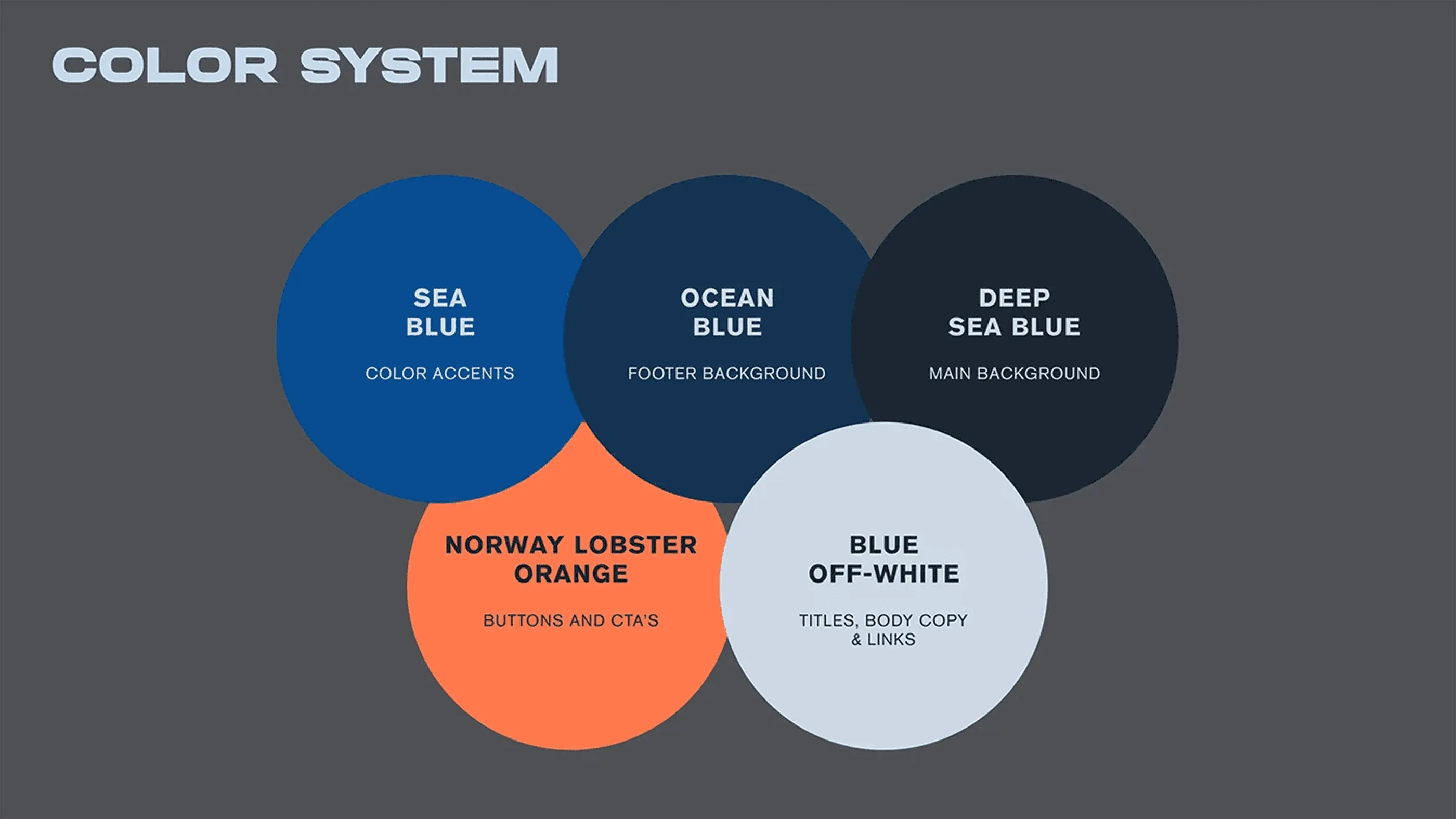
Three blues carry the depth, an off white does the reading and a lobster orange is reserved exclusively for buttons and booking links. That last rule is the one doing the work: because orange appears nowhere else in the layout, every warm element on screen is something you can act on. For a restaurant website where the whole goal is a reservation, tying the accent colour to the action removes any doubt about where to click.
A serif with some swing
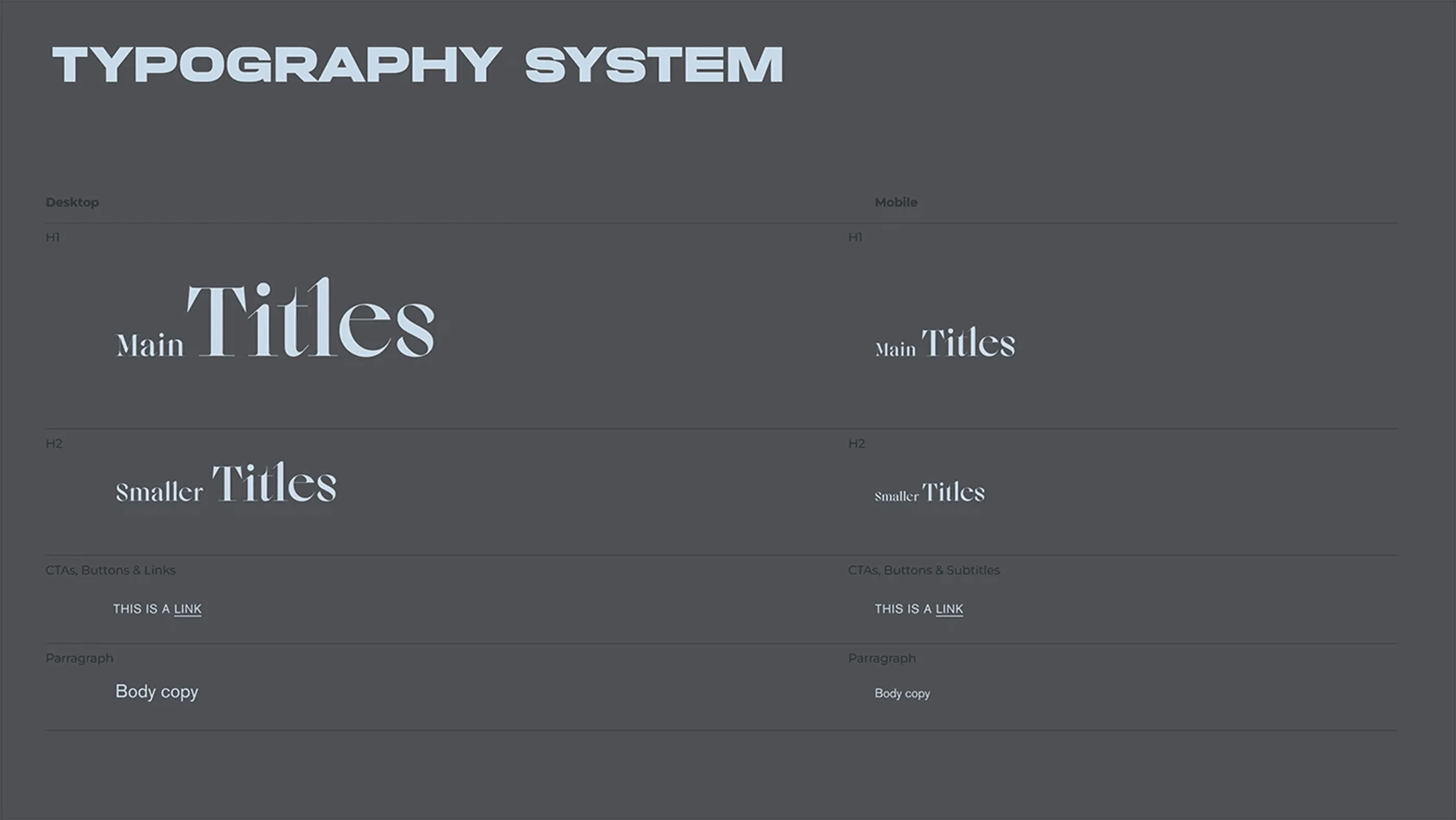
A high-contrast serif with real personality handles the titles, paired with a plain sans for body copy and prices so the menu stays legible at small sizes. Both are specified for desktop and mobile, with the display sizes dropping more sharply than the text sizes. That difference is deliberate, since a headline that works at full width becomes shouting on a phone if it scales proportionally.
Seafood and Calabrian cuisine
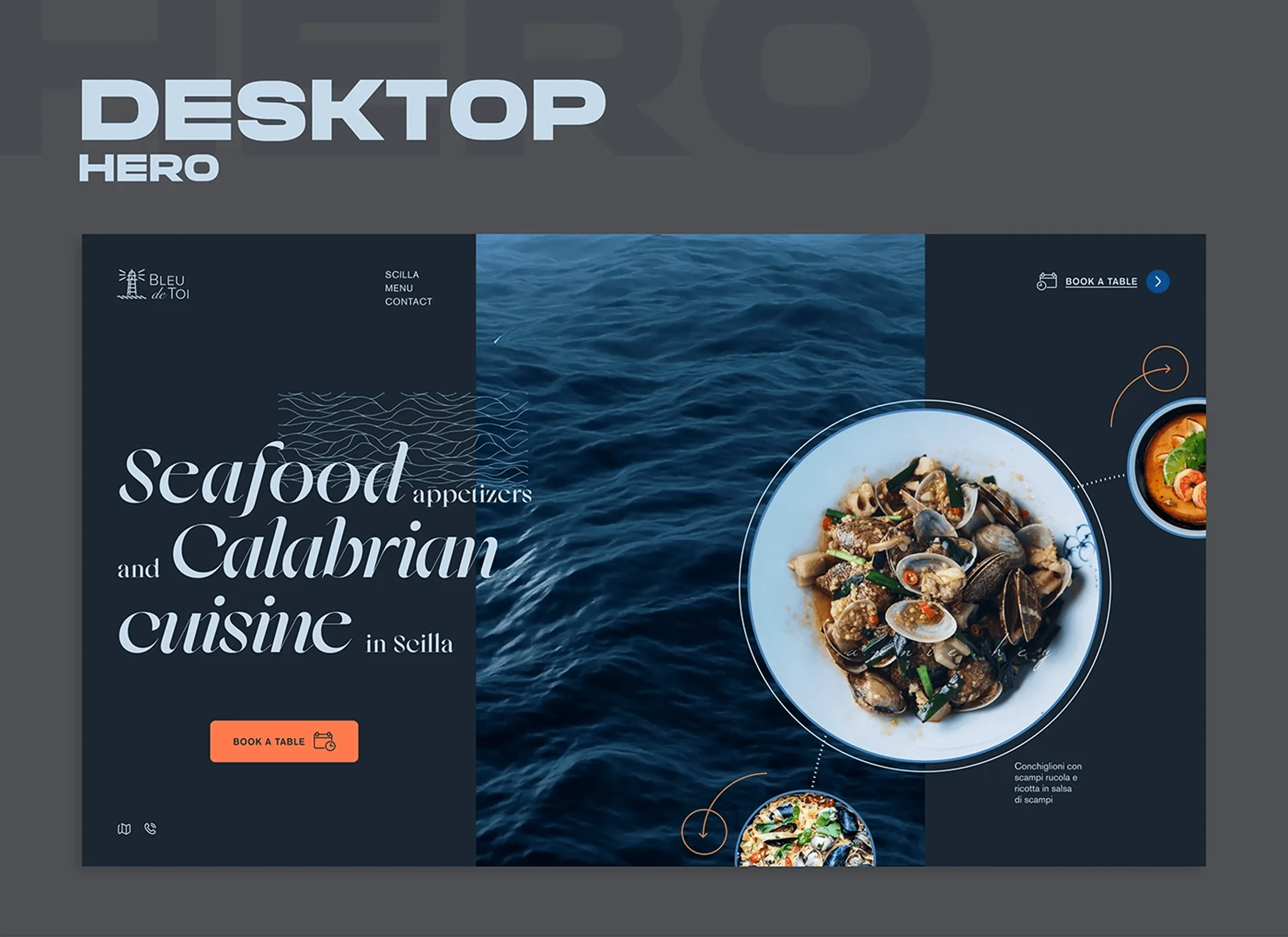
The hero splits into three vertical bands: the serif headline on the left, real sea texture through the middle and the signature dish framed as a circle on the right. Circling the plate is what turns a food photo into a portrait, and the thin connector lines label the dishes without cluttering the composition. One orange button sits under the copy, which is the only call to action above the fold.
Welcome to Scilla
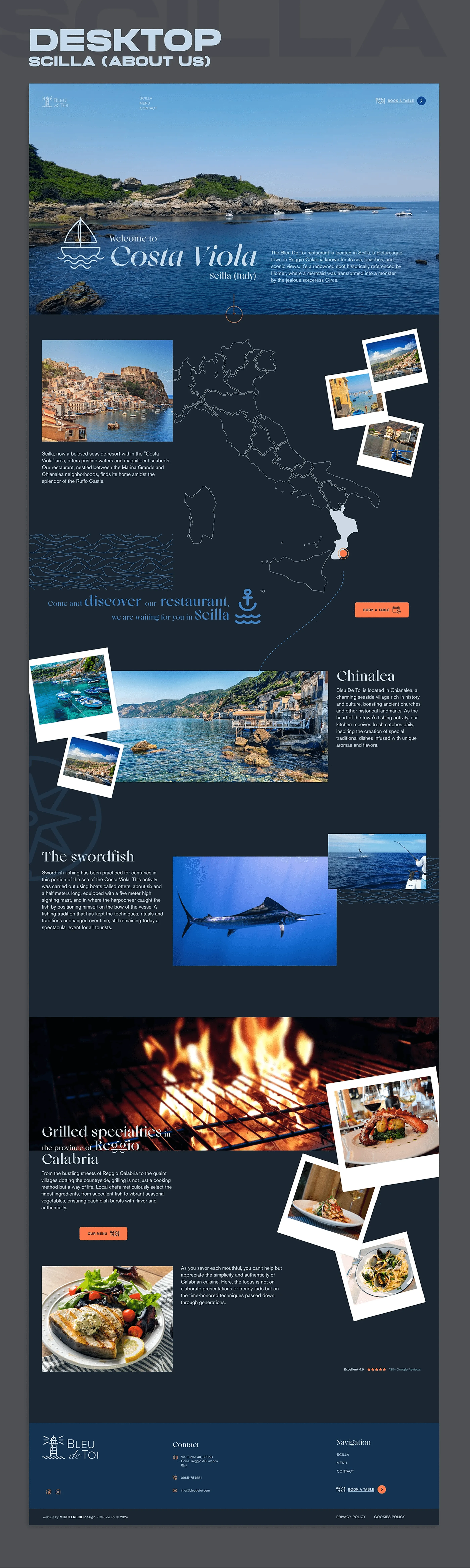
The place before the plate. Costa Viola, the town of Scilla and the legend behind the name, told through photography, a hand-drawn map of Italy and polaroid framing scattered across the layout. Restaurant sites tend to skip straight to the menu, but for a destination location the surroundings are half of what is being sold. The section runs long on purpose and ends on the grilled specialities, which hands the visitor over to the menu.
Homemade pasta, grilled fish
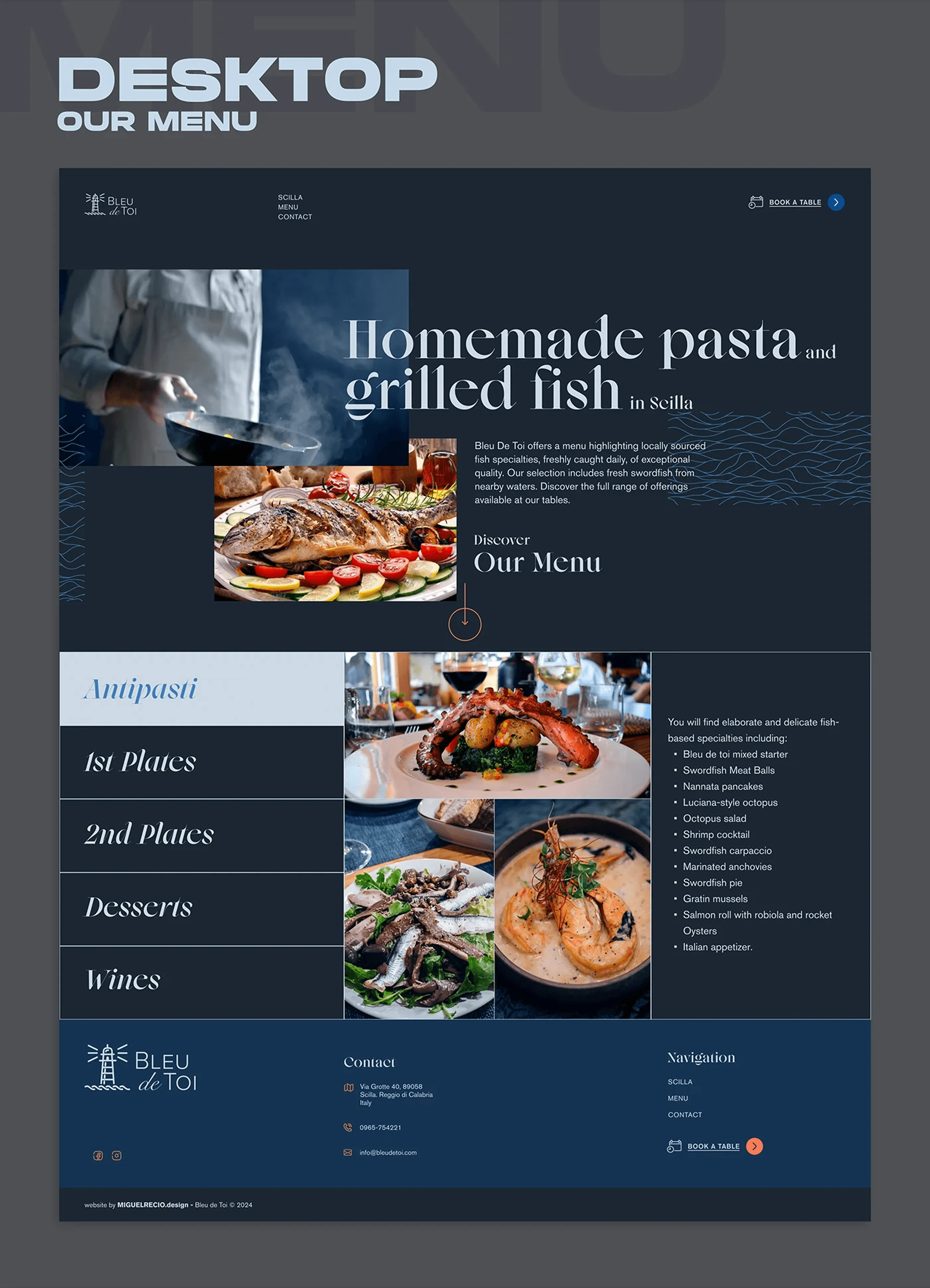
The menu organised by course, with a persistent category list on the left and photography filling the right so the visitor eats with their eyes before reading a single price. Each course loads its own set of dishes without a page change, keeping the browsing continuous. The booking button stays fixed in the header throughout, because in restaurant web design the decision to reserve usually happens mid-scroll rather than at the end.
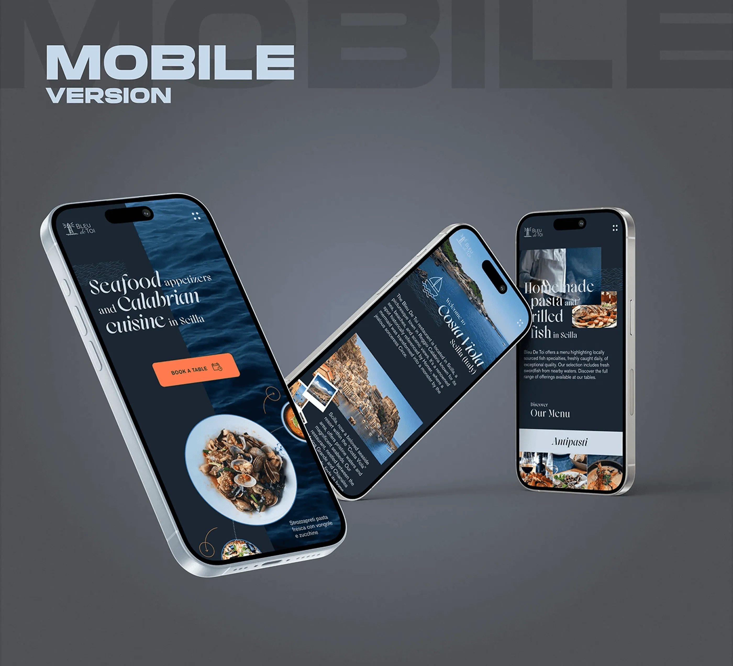
The same restaurant on a phone
The full site rebuilt for mobile, holding the same navy, the same serif and the same warm accent. The three screens shown here cover the home, the story and the menu, which are the three things a hungry visitor actually opens on a phone. Nothing was cut in the responsive design, only reordered and restacked.
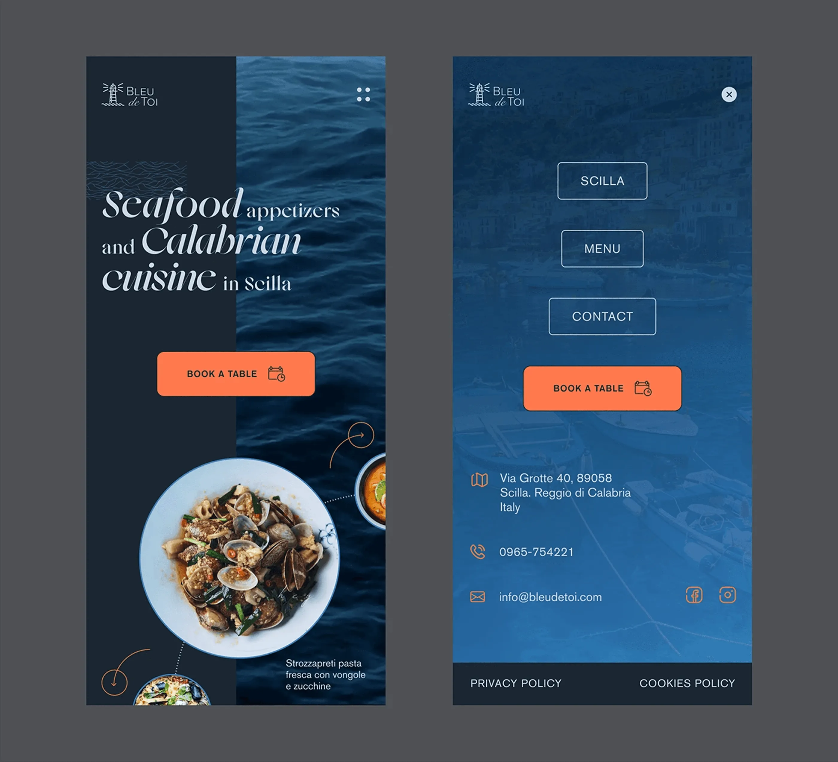
Home and navigation
The mobile homepage keeps the split hero as a vertical stack, with the sea texture behind the headline and the dish anchored low. The navigation opens as a full-screen overlay in sea blue, with large tap targets and the booking button repeated at the bottom. Most restaurant traffic arrives on a phone while people are already deciding where to eat, so booking is never more than one tap from anywhere in the UI.
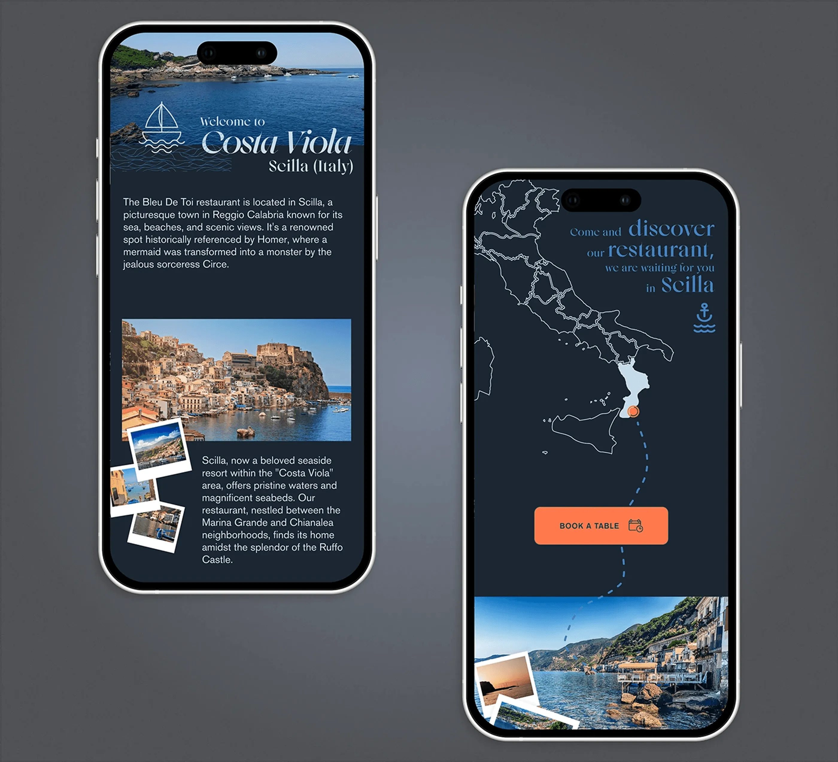
The story, vertical
Costa Viola and the map restacked for vertical reading, with the polaroid framing kept intact so the section still feels handmade rather than templated. The photography drops to a single column while the map spans the full width, which keeps the sense of place at a size where it can actually be read. Atmosphere is the hardest thing to preserve in mobile design and the first thing usually lost.
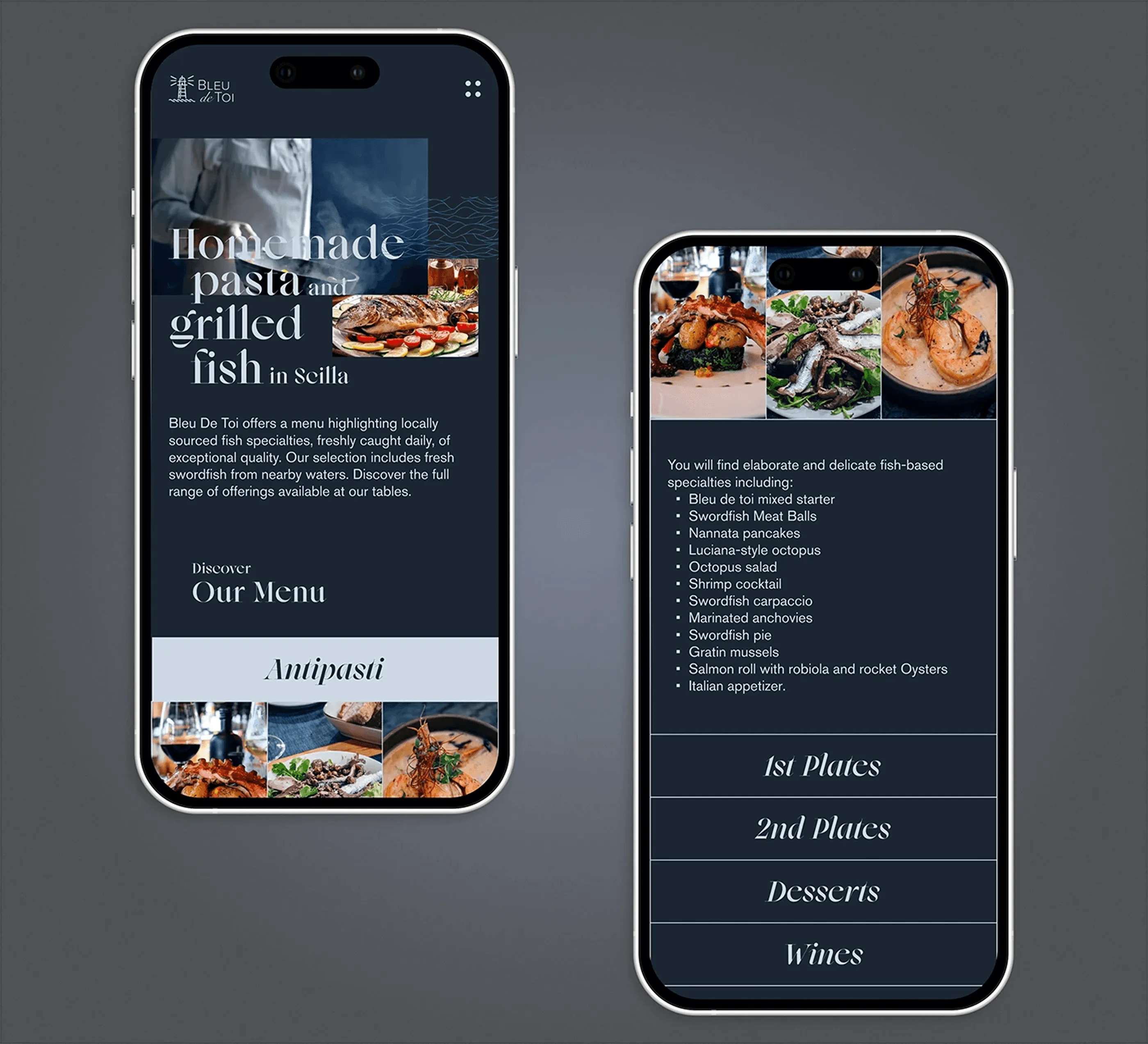
Menu on mobile
The full menu on a phone, with the course categories turned into a horizontal scroll and each dish given its own photograph. Prices stay aligned to the right edge for quick scanning, and the reserve button stays fixed at the bottom of the viewport. Building the mobile menu as a browsing experience rather than a PDF is the single biggest usability gain in this project.
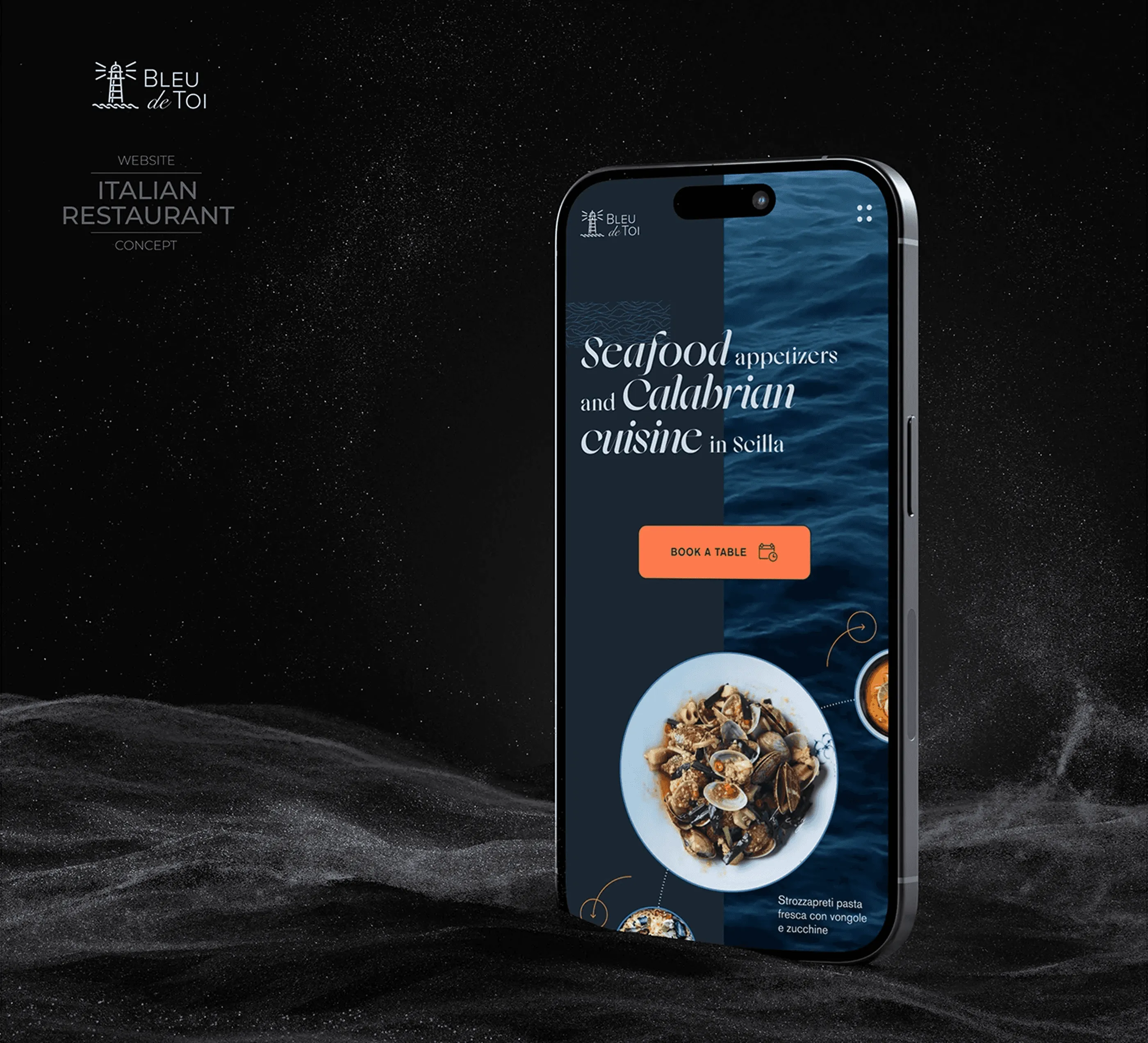
Set on the sea
The closing presentation shot, with the phone half lit over dark water and sand. It exists to sell the atmosphere of the concept in one image, which is what a portfolio thumbnail or a social post has to do before anyone reads a word of the case study.
Need a website like this for your business? See my web design services or book a free call.